MARVEL Exterior Paint — Packaging Design
Project Context
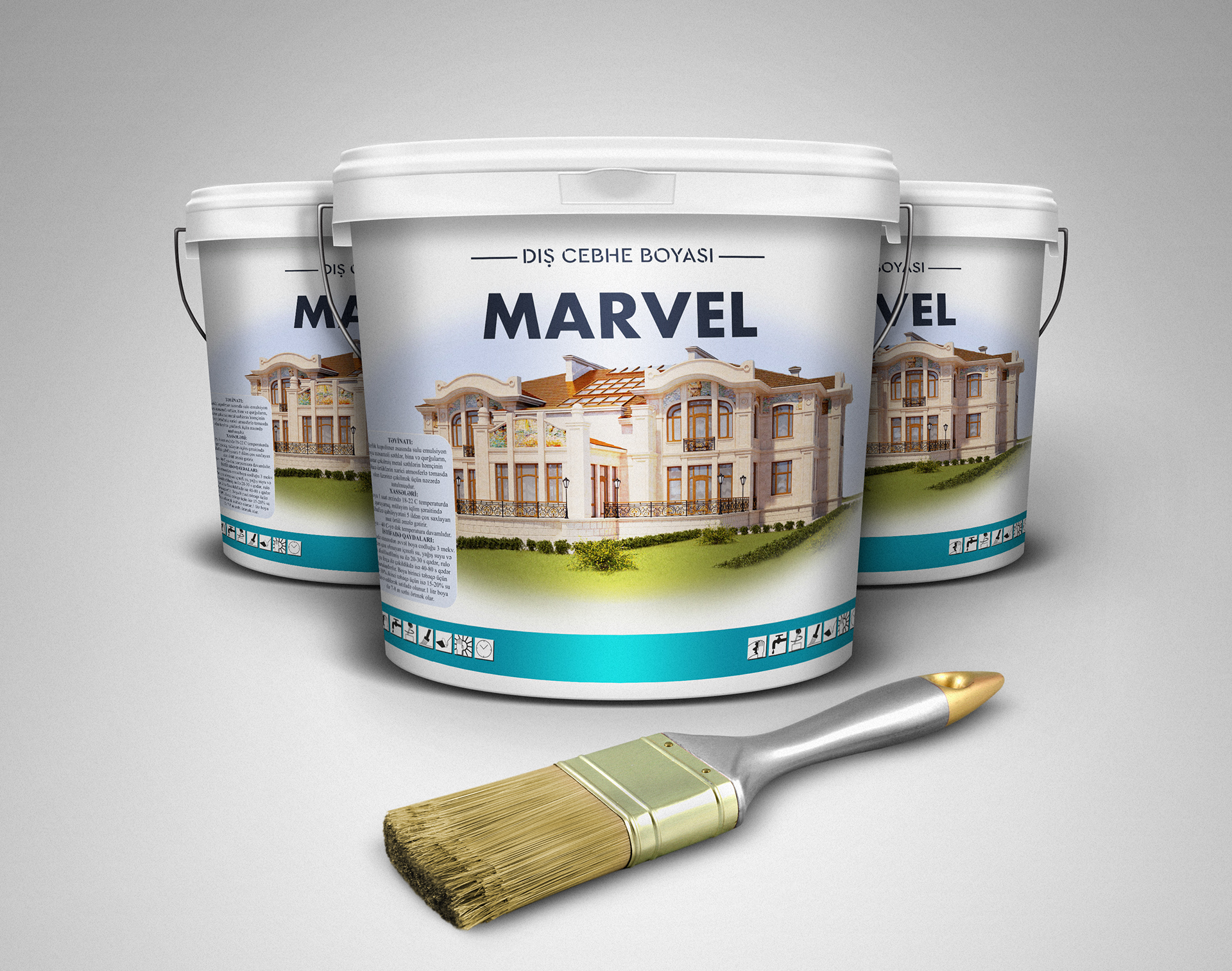
This project involved the concept design and visual branding for MARVEL Dış Cephe Boyası (Exterior Paint). The core objective was to create a package design that conveys quality, durability, and a premium finish for residential properties.
The label design highlights the paint's application with a classic, high-end house rendering, establishing a clear connection between the product and the desired result: a stunning, long-lasting exterior. The clean typography and blue accent band emphasize the product name and its intended use.
Key Design Elements & Features
The packaging utilizes a clean white base for the buckets to evoke a sense of purity and quality, contrasted with a strong, bold font for the MARVEL brand name. The Turkish phrase "DIŞ CEPHE BOYASI" (Exterior Paint) clearly communicates the product category to the target market.
The packaging design for MARVEL paint emphasizes trust and longevity. By showcasing the product in a realistic, ready-to-use scenario, the design instantly communicates its purpose to architects, contractors, and homeowners. The white and blue color scheme is associated with cleanliness, structural reliability, and weather resistance.
Attention to detail in the visual—such as specular highlights on the bucket surface and realistic bristle textures on the paintbrush—ensures a tactile, premium customer perception.
Product Visualization
Created photorealistic 3D mockups of the paint buckets and application tools for marketing materials and client presentation.
Branding Consistency
Ensured the MARVEL logo and exterior application graphics remain legible and impactful across multiple bucket sizes.
Print-Ready Production
Prepared high-resolution vector dielines and CMYK color separations suitable for large-scale offset container printing.
Backed by professional printing leadership at Bigtime Prints. Full compliance with commercial die-cut tolerances, trap values, and color profiles.