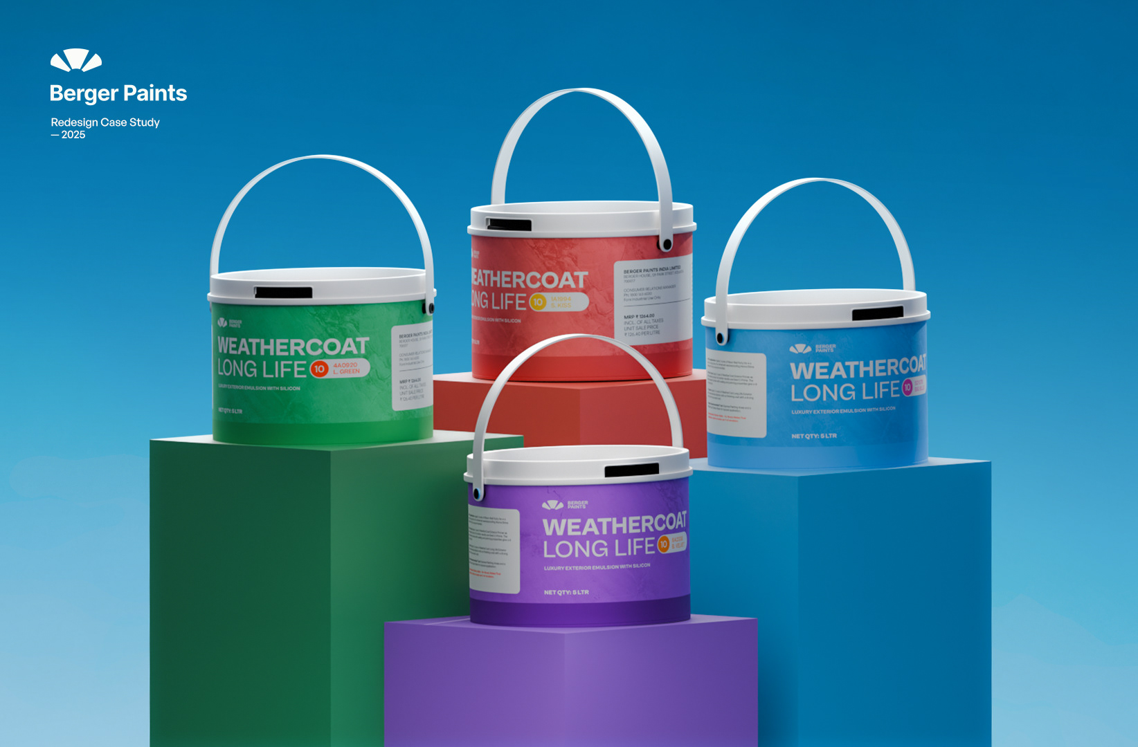

This project presents a conceptual redesign for **Berger Paints' Weathercoat Long Life Luxury Exterior Emulsion Paint**, envisioned for the year 2025. The goal was to modernize the packaging while retaining brand recognition and emphasizing the product's key benefits: durability and premium quality for exterior surfaces.
The redesign focuses on a clean, vibrant aesthetic that communicates the product's advanced formula and long-lasting finish. By utilizing a diverse color palette for the individual paint buckets, the design aims to highlight the extensive range of available shades for consumers.
The primary objective was to refresh the visual identity of Weathercoat Long Life, making it more appealing to a contemporary market while reinforcing Berger Paints' reputation for quality. The design approach involved simplifying the label, enhancing readability, and incorporating dynamic visual elements.
Key design features include a prominent display of the "10 Years" warranty icon, emphasizing the product's longevity, and a clear indication of its "Luxury Exterior Emulsion" status. The use of distinct background colors for each bucket also helps differentiate variants or simply adds visual appeal to the product line.
Achieved a sleek, contemporary look for the packaging with clean lines and vibrant colors.
Clearly highlighted "Long Life" and "10 Years" benefits for immediate consumer understanding.
Used distinct bucket colors to visually separate product variants or color ranges.
The redesign extends beyond just the label to the overall presentation, with the buckets displayed on minimalist, color-coordinated blocks against a smooth blue gradient. This setup enhances the premium feel of the product and suggests a forward-thinking brand image.

The Berger Paints logo is consistently placed at the top, ensuring strong brand recall. The "Redesign Case Study - 2025" subtitle signifies a vision for future product presentation, aligning with contemporary design trends in the paint industry.
This project demonstrates a strategic approach to product packaging, combining aesthetic appeal with clear communication of value proposition. It is designed to resonate with consumers seeking high-quality, long-lasting exterior paint solutions.
In a competitive market, standout packaging is crucial. This redesign aims to not only attract attention but also convey confidence in the product's performance. The bold yet elegant design reflects the 'luxury' aspect of the emulsion, promising both beauty and durability for homes and buildings.
The consistent design language across different colored buckets ensures that while specific shades can be easily identified, the overarching brand and product identity remain unified and strong.
Copyright © Your name
Distributed By Themewagon