
This project involved creating a key visual and illustration style for **Sber Education**, the learning platform by the Russian multinational banking and technology company Sber (formerly Sberbank). The goal was to develop a dynamic, engaging, and modern visual identity that appeals to a diverse range of students and professionals.
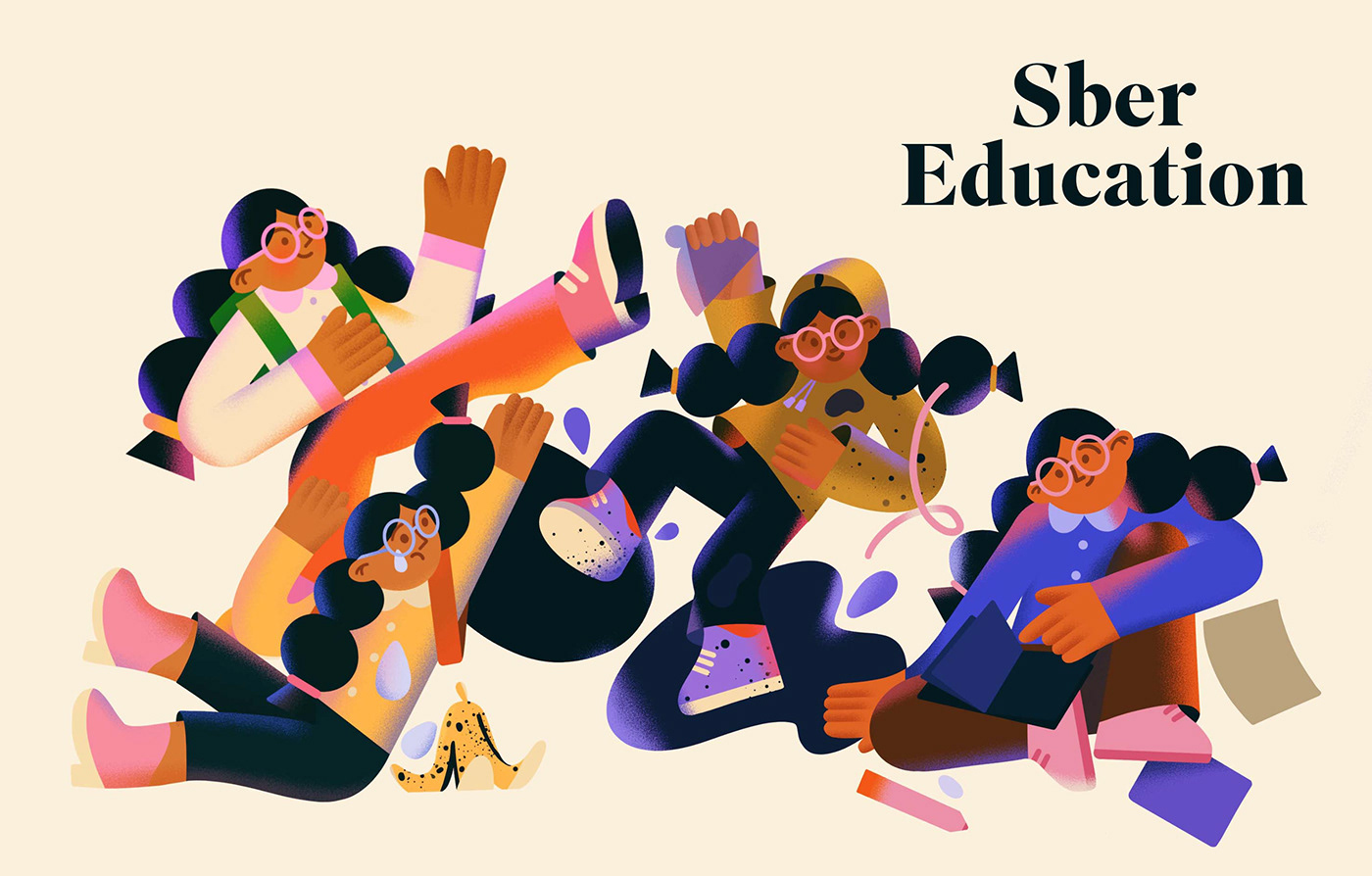
The illustration features a group of diverse, stylized characters in dynamic poses, suggesting motion, collaboration, and the energetic pursuit of knowledge. The design uses a rich, contemporary color palette that aligns with Sber's corporate branding while bringing a sense of youth and creativity to the educational service.
The core objective was to move away from generic stock imagery and establish a unique, recognizable visual language for the educational product. The chosen style is **abstract-flat illustration** with a focus on strong, expressive shapes, playful dynamics, and layered textures to give the characters depth and personality.
The characters are engaged in various learning-related activities, surrounded by subtle graphic elements like scattered papers and drawing materials, reinforcing the theme of active learning and creativity. The illustration style is highly scalable and versatile, suitable for use across the platform's digital interface, marketing materials, and social media campaigns.
Created highly appealing and memorable illustrations to capture user attention in a crowded EdTech market.
Developed a custom color palette and style that integrates seamlessly with the overall Sber brand identity.
Featured a diverse group of stylized characters to represent the broad audience of the education platform.
The illustrations serve not only as marketing assets but also as functional design elements within the user interface (UI), helping to guide users and make the learning experience more intuitive and fun. The characters embody curiosity and motivation, two key concepts Sber Education aims to instill.

The creation of a defined illustration system allows the Sber team to easily generate new assets that maintain a cohesive look and feel. This ensures that as the platform expands its course offerings, the visual brand remains strong and unified across all future content.
This project is a prime example of leveraging custom illustration to inject personality into a large corporate brand's sub-product, making it feel approachable and specialized for its target market.
In the digital education space, a friendly and relatable visual identity is critical for user retention. The fun, slightly exaggerated style of the Sber Education characters helps to reduce the perceived friction of learning, making the entire platform feel less formal and more accessible. They act as visual mascots, guiding the user's emotional experience.
The rich colors, especially the interplay of yellows, blues, and magentas, create a high-contrast, energetic visual that stands out clearly on both light and dark backgrounds.
Copyright © Your name
Distributed By Themewagon